How important is it to have a great logo?

The importance of a great logo cannot be underestimated. Your logo is the face of your business, it should tell people exactly what you’re about – who you are, what you do, your ethos, your hopes and dreams (well maybe not the last one!). Is your logo fun, is it serious, is it modern, is it traditional? Potential customers will get an idea of who you are and whether or not they like what they see in seconds. So, what can you do to impress potential customers?
Keep it clean, clear and simple
Be mindful that your logo will appear across lots of different media – websites, business cards, signage, letterheads, packaging and many more. If your logo features photographs, gradients, highly detailed fonts, shadows etc then you will quickly find out that these don’t display consistently across each medium, it is especially tricky to match up colours across screens and printed materials too. We recommend that you keep your logo to a simple palette of three colours, avoid gradients as much as possible, and go for a good strong font. You will notice that many large international companies follow these rules…..and they know what they’re doing!
Make it memorable
You may have only just started creating your business empire, but having something memorable about your logo makes perfect sense. This could be completed using a clever combination of letters, colours, an image, or a symbol. The beauty of having a symbol as well as text is that you can use it on its own in certain situations too. The Nike swoosh says Nike without saying Nike (if that’s makes sense?), the same for Apple, Shell – the list goes on. Good strong symbols create a visual memory in the mind and allow companies to subtly remind you of their existence without necessarily shouting their name from the rooftops.
Keep it professional
Your logo needs to be unique to you and to your business. How else can it help you stand out from your competitors? Many businesses underestimate the importance of a good logo or the importance of seeking professional help in creating one. We’ve all have seen ads in paper where the company has had a go at it themselves and to be honest, it’s very rarely pretty! If your logo looks like it’s been designed in Microsoft Word people will question your ability to provide them with quality products and services. Just say no to clipart – you can do better!
Colour is key
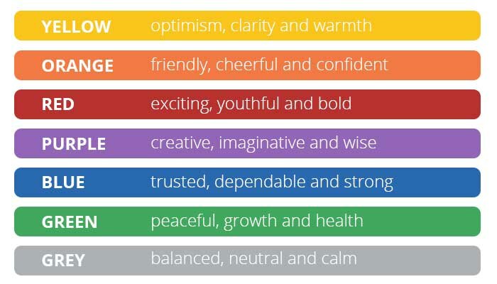
Choosing the colour palette for your logo (and branding for that matter) is incredibly important. Having a little understanding of colour psychology can help you make an informed choices when putting your logo together. There are numerous online articles which go into colour psychology in great detail, however the common associations with popular colours are listed below:
Before you even begin to design your logo you must consider the appropriate colors which are effective in re-enforcing your brand, message and overall tone. Oh, and don’t forget that certain colours have specific associations and meanings in other countries!
Be a font of all knowledge
Font choice for your logo is equally as important – don’t just pick one you like and run with it. You need to ensure that your font or fonts of choice ties in with the branding you have established for your business. Are you a modern business, is your company steeped in history, are you creative, do you provide services or products, what types of product? These classifications can all be represented using the correct font or combination of fonts.
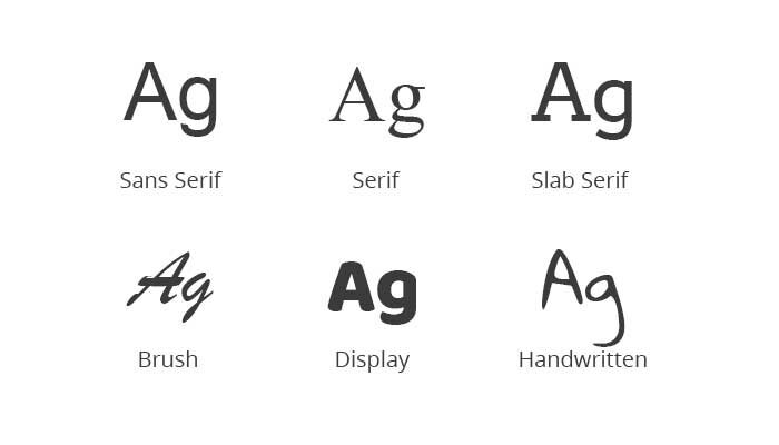
The basics of font psychology are fairly simple:
Serif fonts are classic
Sans Serif fonts are trendy
Handwritten fonts are artsy
Display fonts are powerful
Scripts are fancy
Ensure that you pick the right font for your type of business, use it across many mediums, and you’re well on your way to creating the right impression.
In summary
There is a lot more to logo design than meets the eye. It is essential to get it right at the off-set in order to communicate effectively with potential customers. It’s never easy to change your logo or branding after the event so give it careful consideration. If you need professional help or guidance then why not give us a call?
The importance of a great logo cannot be underestimated. Your logo is the face of your business, it should tell people exactly what you’re about – who you are, what you do, your ethos, your hopes and dreams (well maybe not the last one!). Is your logo fun, is it serious, is it modern, is it traditional? Potential customers will get an idea of who you are and whether or not they like what they see in seconds. So, what can you do to impress potential customers?
Keep it clean, clear and simple
Be mindful that your logo will appear across lots of different media – websites, business cards, signage, letterheads, packaging and many more. If your logo features photographs, gradients, highly detailed fonts, shadows etc then you will quickly find out that these don’t display consistently across each medium, it is especially tricky to match up colours across screens and printed materials too. We recommend that you keep your logo to a simple palette of three colours, avoid gradients as much as possible, and go for a good strong font. You will notice that many large international companies follow these rules…..and they know what they’re doing!
Make it memorable
You may have only just started creating your business empire, but having something memorable about your logo makes perfect sense. This could be completed using a clever combination of letters, colours, an image, or a symbol. The beauty of having a symbol as well as text is that you can use it on its own in certain situations too. The Nike swoosh says Nike without saying Nike (if that’s makes sense?), the same for Apple, Shell – the list goes on. Good strong symbols create a visual memory in the mind and allow companies to subtly remind you of their existence without necessarily shouting their name from the rooftops.
Keep it professional
Your logo needs to be unique to you and to your business. How else can it help you stand out from your competitors? Many businesses underestimate the importance of a good logo or the importance of seeking professional help in creating one. We’ve all have seen ads in paper where the company has had a go at it themselves and to be honest, it’s very rarely pretty! If your logo looks like it’s been designed in Microsoft Word people will question your ability to provide them with quality products and services. Just say no to clipart – you can do better!
Colour is key
Choosing the colour palette for your logo (and branding for that matter) is incredibly important. Having a little understanding of colour psychology can help you make an informed choices when putting your logo together. There are numerous online articles which go into colour psychology in great detail, however the common associations with popular colours are listed below:
Before you even begin to design your logo you must consider the appropriate colors which are effective in re-enforcing your brand, message and overall tone. Oh, and don’t forget that certain colours have specific associations and meanings in other countries!

Be a font of all knowledge
Font choice for your logo is equally as important – don’t just pick one you like and run with it. You need to ensure that your font or fonts of choice ties in with the branding you have established for your business. Are you a modern business, is your company steeped in history, are you creative, do you provide services or products, what types of product? These classifications can all be represented using the correct font or combination of fonts.

The basics of font psychology are fairly simple:
Serif fonts are classic
Sans Serif fonts are trendy
Handwritten fonts are artsy
Display fonts are powerful
Scripts are fancy
Ensure that you pick the right font for your type of business, use it across many mediums, and you’re well on your way to creating the right impression.
In summary
There is a lot more to logo design than meets the eye. It is essential to get it right at the off-set in order to communicate effectively with potential customers. It’s never easy to change your logo or branding after the event so give it careful consideration. If you need professional help or guidance then why not give us a call?
